
RESEARCH GOAL
The College of Engineering and Information Technology (COEIT) website serves as an information hub into various dimensions, ranging from the departments and faculty to a myriad of projects in University of Maryland Baltimore County (UMBC). Its Research section is the canvas for this usability study. Collaborated with another researcher.
Key research questions and areas:
- Do users find the website aesthetically pleasing?
- Do users feel encouraged to learn more about research?
- Are the strengths and achievements of the company highlighted effectively?
- Does the website attract visitors to stay on the website and learn more about the company?
- Do users explore the website to learn more about research activities?
METHODOLOGY
A ten-week field study to assess the effectiveness and usability of the COEIT research website as participants used them in their natural environment. Study participants were located across the United States.
- Phase 1: Conduct qualitative contextual inquiries and interviews for the target demographic.
- Phase 2: Heuristic Evaluations by two experts.
- Phase 3: Participatory Design sessions and Think-Aloud Evaluations.
- Phase 4: Prototyping and A/B Testing
INDUSTRY ANALYSIS
Exploration and deep dive was conducted for companies in the same industry sector or market niche who compete with this company’s products and services.





RECRUITING
Demographic: Prospective and current students, professors and external researchers
Gender: 50/50
Ethnicity: Mix
Devices: Google Chrome and Mozilla Firefox browsers on laptops and mobile devices
| Participant ID | Gender | Age | Role | Tech. Experience |
|---|---|---|---|---|
| P1 | Female | 26 | Current Student | 4 |
| P2 | Female | 34 | Current Student | 4 |
| P3 | Male | 28 | Current Student | 3 |
| P4 | Male | 41 | Professor | 5 |
| P5 | Female | 23 | Prospective Student | 3 |
| P6 | Male | 25 | External Researcher | 5 |
| P7 | Female | 26 | Current Student | 4 |
| P8 | Female | 24 | Current Student | 5 |
| P9 | Male | 26 | Prospective Student | 5 |
| P10 | Male | 26 | External Researcher | 5 |
| P11 | Male | 24 | Prospective Student | 4 |
| P12 | Male | 29 | Professor | 3 |
CONTEXTUAL INQUIRIES AND INTERVIEWS
Participants were recruited and observed in their natural element. Contextual inquiries were conducted because we wanted to know more about their website experiences in general by letting users talk about what they are doing and why they are doing it. Used a Think-Aloud protocol.
I: “While using the website, you exclaimed that you were searching for available fellowships. Why did you navigate to the Graduate Research page?”
P2: “Because I honestly felt that’s where it would be. I eventually became frustrated and gave up and looked for other funds instead.”
Participants were asked to participate in semi-structured interviews. Specific inputs from the participants enabled us to strengthen the findings and combine the insights obtained from the contextual inquiries.
This led me to the following findings:
- Impressed by the amount of information.
- Unable to navigate to the homepage efficiently.
- Unnatural nesting of navigational menus.
HEURISTIC EVALUATIONS
Heuristic evaluations were conducted to determine the extent of the website’s functionality and its effect on user experience. To achieve this, two evaluators strived to identify specific issues with the website, in accordance with Nielsen’s Ten Heuristics. The team agreed the UI should assist users in recognizing preexisting patterns rather than recalling information.
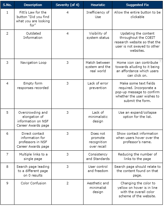
According to the severity ratings assigned by the evaluators, issues of most importance seem to be related to:
- Unnecessary loops of navigation
- Redundant links
- Outdated images and text
- Lack of appropriate signifiers to accompany affordances
- Issues with feedback form access and submission
- Unclear utility
- Overcrowding of information with large blocks of text
USER PERSONAS AND CHARACTER EMBODIMENT
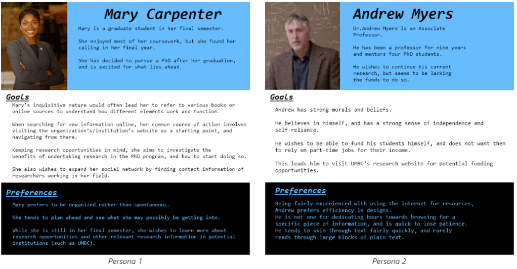
The participants of these studies included graduate students interested in research, PhD students at different stages of their program, and professors trying to find resources for their students. There are clear differences in their occupations and current stages of their research goals. However, closer inspection revealed underlying differences in their personalities, needs and characteristics as well. Two personas were created to reflect these key characteristics of users, which will develop an understanding of current users, as well as potential users.
PARTICIPATORY DESIGN AND THINK-ALOUD EVALUATIONS
Participatory design sessions and contextual inquiries led to the development of initial mockups motivated by design solutions suggested by participants.
P3: “Why is the NSF information here? This is the last place I would look.”
I: “Where were you expecting to find it?”
P3: “On a separate tab dedicated to NSF. Not in this list.”
I: “And where would this tab appear?”
These mockups were shown to participants, who were asked to evaluate these prototypes in think-aloud evaluation sessions. Their feedback was recorded using UARs and this information was used to develop medium fidelity prototypes, which were the foundations used for A/B testing.

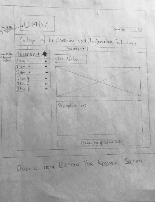
Six prototypes of low fidelity were eventually developed using a combination of sticky notes and sketches. The design of the prototypes was mainly motivated through my PD sessions, as well as UARs from heuristic evaluation.
This led me to the following findings:
- Poor visibility of the feedback button.
- Unclear background image for the banner.
- Inconsistent color scheme and mapping of the search bar.
Prototyping and A/B Testing
The A/B testing sessions enabled validation of the medium-fidelity prototypes and verification of whether the issues found by previous participants were effectively addressed.

Implementing a new color scheme were met with mixed reviews from participants in A/B testing sessions. Some liked that the prototype’s color scheme matched UMBC’s theme, others felt that the change may be too jarring for returning users.
P5 (Initial Website): “I needed to scroll down quite far to find some research opportunities.”
P7 (Prototype): “Yeah, pretty quick, that didn’t take me long at all to find.”
This led me to the following findings:
- Higher efficiency measured in the prototype (from timed activities).
- Higher visibility of information and feedback button in prototype.
- User experience goals of satisfaction and enjoyment were higher in the prototype (from surveys).
INSIGHTS
- Content Information: Participants felt that there was a lack of information related to specific topics in the original website. This matched with our client’s expectations; enhance visibility of content which would improve collaboration among researchers.
- Consistency: Participants were frustrated by the lack of internal consistency within the website, signifying repeated usage of the back button and poor navigation cues.
- Users and Emotions: Impatient users would cut a frustrated figure due to the loopholes in navigation or blame the content curators for not giving them the appropriate results. Users also express themselves as independent individuals, exploring interesting areas of research. Overall, users of this website tend to be inquisitive about the content presented but were left expecting more after their experience.
RECOMMENDATIONS
- Adding simpler and more visible navigation cues, through a breadcrumb trail and an appropriate home button next to the homepage link would improve information scent.
- Improving internal consistency in image placement, menu navigation and submenu distribution.
- Reducing information overload by removing duplicate links and removing redundant text throughout the website.
- Reorganizing the grid structure for all webpages to improve readability of text and allow users to scan for information more easily. Grouping information effectively would help users attend to information they seek.
- Adding more contact information for professors, faculties, events, programs and research centers to allow users to directly involve themselves through the website.
- Improving ease of identification of important buttons (home button and feedback button) by implementing a home icon next to the home tab, and an information button for the feedback form.
- Changing the color of the currently selected navigation tab for easier identification.
- Implementing a back button in a consistent location to improve efficiency of navigation.
- Changing the background of the banner image to make the text “College of Engineering and Information Technology” more legible for users. A solid color is an effective option.